
October 25, 2016
Political reporting focuses on human behavior: both the messages candidates choose and how people respond. But in this year’s unconventional election cycle, traditional coverage alone only tells part of the story. Enter Bloomberg Politics, which is forging a new, data-driven journalistic approach.
“Working with numbers is a way through all the noise.” – Bloomberg Politics editor Kelly Bare
“Working with numbers, as long as you have discipline about doing it, is a way through all the noise to present insights into what the campaigns are doing, the impact it’s having on voters, and what might actually happen,” says Bloomberg Politics editor Kelly Bare.
Read on for three ways Bloomberg Politics is mining unmatched data sets to impart a unique view of how elections are won and lost.
1. Radical Transparency: the Bloomberg Politics Poll Decoder
New technologies have driven increasing sophistication in the way campaigns conduct their own polling – and in the way journalists can crunch poll numbers. But what’s behind the polls themselves, and what does it mean for the big picture? That question is at the heart of the Bloomberg Politics Poll Decoder.

“Usually a poll comes out and there is reporting on the numbers, and oftentimes it just looks at the horserace – what presidential candidate is ahead and by how much,” explains Bare. “But as we know this time around, there are various demographic constituencies that are getting targeted like crazy. So we said, ‘How do we show people what polling looks like for these slices?’ ”
Seeing those details – what percentage of each polling sample was made up of Republicans, Democrats and Independents, for example – provides deeper insight than a single poll would, or even simply aggregating poll data.
The Bloomberg Politics Poll Decoder is a dynamic visualization that makes nuanced insight easily accessible. It plots individual national polls – credible phone surveys by major media institutions such as Bloomberg, YouGov, Morning Consult, NBC, and ABC, in some cases including otherwise unpublished data – to show how subsets are voting, and what the polling samples looked like demographically and by party affiliation.
“Data moves. We build these models and they track things and then we have an opportunity, at any given moment, to tell a story off of that and point people to that for further analysis.” – Bloomberg Politics editor Kelly Bare
The interactive graphics pair with an explainer by Bloomberg Politics reporter Ken Goldstein that makes sense of the different methods different pollsters use, what the variables are and why polling has a “weight problem” – a pun on the post-survey manipulations that all pollsters use to tweak their data sets.
“That’s a level of transparency into how polling works that’s useful in assessing what’s really going on in the presidential race,” says Bare. And it infuses Bloomberg’s journalism with new data tools, Bare adds: “Data moves. We build these models and they track things and then we have an opportunity, at any given moment, to tell a story off of that and point people to that for further analysis.”
2. New Voter Math: The Persuadables
“If everyone voted the way they did in 2012, we’d know the outcome already,” Bare points out. This year is different: from “Berniependents” to “Never Trump” Republicans and everywhere in between, the American electoral landscape is complex and fragmented. There are also higher-than-normal numbers of undecided voters. That’s making it harder for campaigns to know which voters they can win over, and the best ways to message them.
“If everyone voted the way they did in 2012, we’d know the outcome already.” – Bloomberg Politics editor Kelly Bare
Bloomberg Politics is breaking that down with a series of special reports on the Persuadables. Drawing on the vast amounts of data within voter files – a set of interlocking databases that campaigns and marketers use – reporters Steve Yaccino and Sasha Issenberg boil battleground states down to straightforward math equations that set a “win” number, mapping out scenarios for reaching it via three groups: reliable base voters; those who are loyal to a party, but may not vote; and those who are persuadable – the independents and swing voters.

The series looks at the effects of things like early voting and third-party candidates on the race, and also zooms in on specific areas of the country, such as “Rust Belt contingencies and economic insecurity – mapping it back to factory closings,” for one story, Bare says. Reporters and editors pull in layers of data that can illuminate what’s happening in that market. “We’re considering what’s happening in a part of the country that’s quantifiable, and we’re tying that to the persuadable pool.”
The final story in the eight-part series will publish the week before Election Day – and will include analysis of actual early-voting returns so far, giving a preview of what’s to come on November 8.
3. Show Me the Money: TV Ad Spend Tracker
Bloomberg Politics is also applying a unique formula to television advertising uncover what campaigns are thinking, and who they think is persuadable. Instead of looking at a raw number spent, the Bloomberg Politics team “looks at dollars spent per electoral vote,” Bare says. That means they’re getting a number that directly corresponds to what’s at stake on the road to 270 electoral votes.
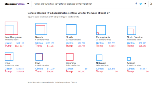
“Looking at the number of votes in a state where a candidate is spending a lot of money can give you a sense of how winnable and how important that state is to their strategy,” explains Bare. “Conversely, if they are not spending, they’ve given up or they think they have it in the bag.”
Working closely with Bloomberg’s in-house Graphics team, Bloomberg Politics tells the story two ways: through a pie chart that maps TV ad spending over time by each candidate, and through overlapping squares that illustrate the ratio of spending per electoral vote.
“When a graphic tells a story well, it’s so much more powerful than reading a paragraph,” Bare says, adding that “Bloomberg has a lot of people who are wonderful with data. It’s really exciting to see how much insight we can glean – and then stitch into stories and headlines that more people can understand.”
– Jen Robinson | October 25, 2016